Thursday, November 12, 2009
(H)ART of Minneapolis

Thursday, October 29, 2009
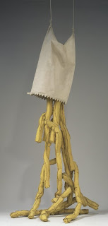
Shoestring Potatoes Spilling from a Bag

Thursday, October 15, 2009
When My Mirror Speaks

"I believe that Man's first real figurative experience is the recognition of his own image in the mirror: the fiction which comes closest to reality. But it is not long before the reflection begins to send back the same unknowns, the same questions, the same problems, as reality itself: unknowns and questions which Man is driven to re-propose in the form of pictures." -- (Michelangelo Pistoletto,1964)
http://www.artsconnected.org/media/cb/ca/35150125d33e05b280c64732c9fd/1024/768/20816.jpg
Michelangelo Pistoletto created this work; it is at the Walker Art Museum. It is titled Tres Ragazza Alla Balconata, which translates to Three Girls on a Balcony. I was given a tour of the museum as a part of my Orientation to Art and Design class’s trip to the Walker. The tour guide did a great job of explaining many of the works of art to my classmates and me. Some things I learned about this work were that it was made as part of the Arte Provera period during World War II. Arte Provera means “poor art”. This is because artists would take things used in art and make them inexpensively. Artists during the Arte Provera movement would use metal, wood, sand, twigs, and other found materials that they could get cheap. The artwork Tres Ragazza Alla Balconata was made using tissue paper and metal. The mirror is actually highly polished stainless steel. The girls on it are painted tissue paper pasted onto the metal. I found it to be very interesting that Pistoletto’s art was all made so inexpensively. This made it more impressive.
I have seen Tres Ragazza Alla Balconata by Michelangelo Pistoletto multiple times on my trips to the Walker. It has always interested me and been one of my favorite pieces in the museum. I enjoy that the art is always changing. The feeling of the work is constantly being altered by where the art is located, changing amounts of light due to what time of day it is or the season, and the people looking at it or who are near it. If a person chooses to look at the art they can't help but become a part of it.
In the work, Tres Ragazza Alla Balconata the backs of three girls leaning over a railing are pictured. They are pasted on a reflective mirror-like piece of metal. It is like the three girls are looking at the viewer as he is reflected in the metal. I have tried and have often see other people trying to pose in front of the mirror like they are leaning on the railing with the three girls, but it is simply not possible. It is only possible for the viewer to be on the other side of the railing with the girls looking at them. The body language of the three girls looks to me like they are relaxed and at ease. That they are neither impressed nor disgusted by what they are looking at, just indifferent. It could be possible that the girls are an inner reality while the things reflected in the mirror are real. It is also possible that it is the exact opposite. It could be showing that all our actions are done as a show for the viewing of others. That nothing that anyone does is original. That everything is all a mirror image of things already done. Life is a monotonous performance put on for the others around us, but not for ourselves. The three girls could also be a representation of god. They seem to be looking down at all the people who happen to walk into the view of the mirror. They passively watch, but they do not interfere with the things in their view, their environment changes, but through it all they remain the same. This relates to what I said earlier about people trying to lean on the railing with the three girls. It is not possible to be pictured in the same way that they are yet people still try. This is similar to the way that people over history and in the present have tried to seek a godly status, but always find themselves unable. There is no way a person could ever stop trying to please others around them and just passively watch as the girls do.
Thursday, October 8, 2009
Midway Contemporary Art - The Hill Upstairs, Jay Heikes

At The Midway Contemporary Art’s The Secret Life of Objects exhibit I was most impressed with and interested by a work by Jay Heikes called The Hill Upstairs. It was made using beet juice and coffee on ceiling tiles.
As I walked into the exhibit I didn’t even notice this work, it blended into the atmosphere so well. Also, I had no reasons to look up at the ceiling where it was installed. I looked at many works of art in the exhibit. After I looked at all I thought was there my attention was directed to a piece of paper given to us by the curator earlier. The sheet had names of all of the art works and their locations in the building. I noticed that there were some labeled as being in the Gallery Entrance where I hadn’t noticed any earlier so I searched them out. I was surprised when I looked above the front desk and saw a stained ceiling. This was actually The Hill Upstairs by Jay Heikes. It looked similar to a water stain I had seen in the ceiling of my old house. I remember that stain as being an embarrassment to my family. They did not want company to see the water damage. They thought it made the house look trashy. This work was different than that water stain, it was made purposefully by an artist. Closer inspection revealed the craft and multiple colors in the work: pinks, browns, reds, and greens. It is a beautiful work. It is simple yet stunning. It hadn’t occurred to me that a stained ceiling could be art. As I looked at it I could understand where the title came from. The stain looked similar to grassy green hills in the distance. It made me want to find out all I can about the artist.
A woman working at Midway Contemporary Art told me a little about the artwork and artist, Jay Heikes. At first I thought that the work, which is done on ceiling tiles, was a part of the building. It turns out the piece was specially installed as part of the exhibit. I was told that after the exhibit it is likely that all of the pieces of the work will be taken down and disposed of. I found out that Heikes made the work by laying all of the ceiling tiles out on the floor and staining them then later installing them in the gallery entrance over the front desk. The piece fit in so well with the décor of the gallery that I didn’t even notice that it wasn’t a part of the actual ceiling of the gallery, but that it hung just below it.
After seeing The Hill Upstairs I watched one of Heikes’s videos called So There’s This Pirate… (http://www.marianneboeskygallery.com/artists/jay-heikes/video/). It was a video of him with his hair tucked into his glasses standing in front of a striped curtain telling a story. The story is about a pirate and his rude parrot that is constantly insulting him. I’m not sure if it was his intention, but I found the whole thing to be hilarious, but it interested me. I found myself watching it multiple times and trying to explain it to friends and family later in the day. I think it might be one of those things you have to see to understand, it was just so weird I couldn't stop replaying it in my head.
I also did some research on Jay Heikes’s background. I found out many interesting things. He lives and works in Minneapolis. One online article stated that, “Jay Heikes’ practice explores the role of the artist, seen as a kind of entertainer. Through his props, sculptures, drawings, static ‘TV screen’ paintings, he continuously re-tells a story or a joke, as in a theater of absurdity, where stasis and repetition create an existential dilemma” (http://www.federicaschiavo.com/artists/jay-heikes). Of the work I have seen by him I found this statement to be extremely true. It seems like all of his works are a private joke to himself about the absurdity of humanity. I also found some interesting quotes from Heikes himself that helped me to learn more about him as a person. He has said, “While growing up in New Jersey I found it impossible to believe that that was the way the world really was. With its shopping malls, massive amounts of pop culture and troubling friends, I chose to seek out other places while still being haunted by the nostalgia of a state so eschew” (http://www.bushfellows.org/fellows/show/5420). I found Jay Heikes to be very interesting. I am glad that I went on the search for the artwork in the gallery entrance and noticed his fantastic yet simple artwork, The Hill Upstairs.
Tuesday, September 22, 2009
Mining the MIA


Mining the MIA
If I were to make my own installations of items from MIA to challenge the viewer’s assumptions about those works through their proximity and interaction I would choose the three works shown above. I would have the pieces in a room that has black walls and black floors possibly with dim or red lighting, but with the pictures brightly illuminated. One of the pieces is a huge picture of an open mouth. The next picture is of a framed painting that has the words Normal Desires in it hidden in a mess of black paint. I would also include the sculptures of what looks to be two dead sheep lying on the ground mirroring the other’s position. I believe that the effect of placing these three pieces together would be eery and disturbing. I want the pieces to make the viewer think about things not talked about and about private life. The Normal Desires painting is what spurred the whole idea. The picture is dark and messy looking, not "normal" in any way. When I saw it gave me a feeling that was the opposite of normal. It was a complete contradiction of itself. I wanted to intensify this feeling so I added other disturbing imagery. I think that the images of the dead animals and the large open mouth strengthen the original message of the painting. The disturbing display is meant to create questions from the viewer. The display conveys an unsettling vision of the unusual and things usually kept private.

Thursday, September 17, 2009
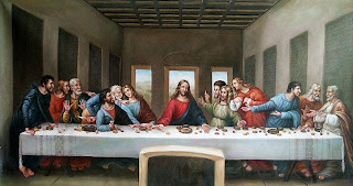
Postmodernism


